Increase BetterSleep sleep tracker adoption by 25% by highlighting user value
At BetterSleep, we wanted to enable users to track their sleep while listening to content. We rolled out an MVP version with just three screens to help users get started and to gather enough data to improve the entire flow. However due to the simplicity of this version, users were unable to experience the full value of the tracker.
Role
Product Designer
Team
1 Product Designer,
1 Product Manager,
2 Engineers
1 UX Writer
Platform
iOS & Android
Scope
Product research, UX UI design, Brainstorms, Prototyping
Timeline
3 months
Tools
Figma, After Effect, Usertesting.com
Process
Where should we start?
We planned the entire project to be implemented in three phases:
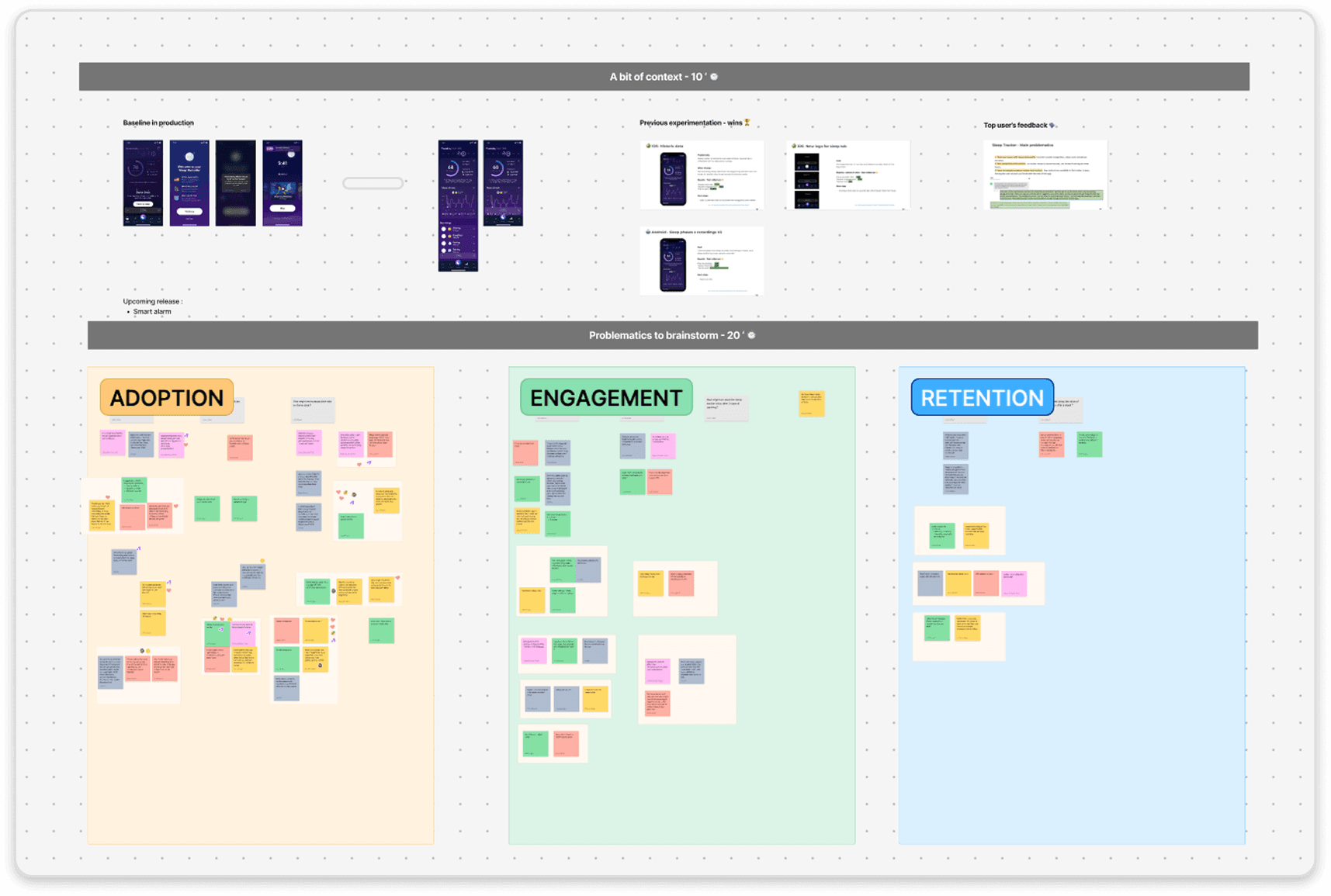
Discovery: we take a deep dive into the data and conduct user surveys and interviews to gain a better understanding of their frustrations. All this information will be used to generate ideas for improvements.
Ideate: Now that we have our data, user insights and ideas from our brainstorming sessions, we did some scoping with engineers to define the improvements that could have the greatest impact (using the RICE scoring system). Some ideas then stood out, and we were ready to create wireframes based on them.
Delivery: After several rounds of design reviews and adjustments, the improvements were developed and we were ready to conduct an AB test.
After we identified the key areas to focus on, I moved onto devising the app structure and what the user flows would look like for different user roles. Those different roles needed to have different levels of access to the tools and information regarding the wedding, meaning they would have a slightly different user flow so I ended up creating a lot of flow charts.
Problematic
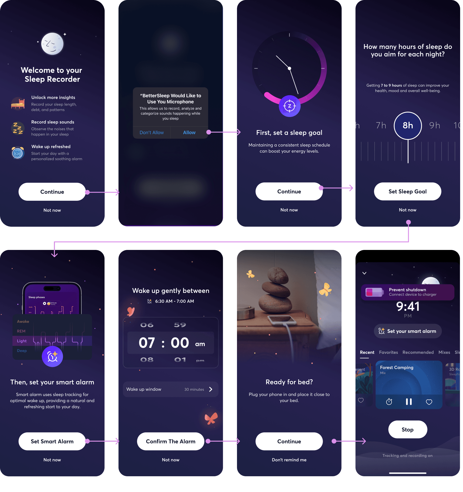
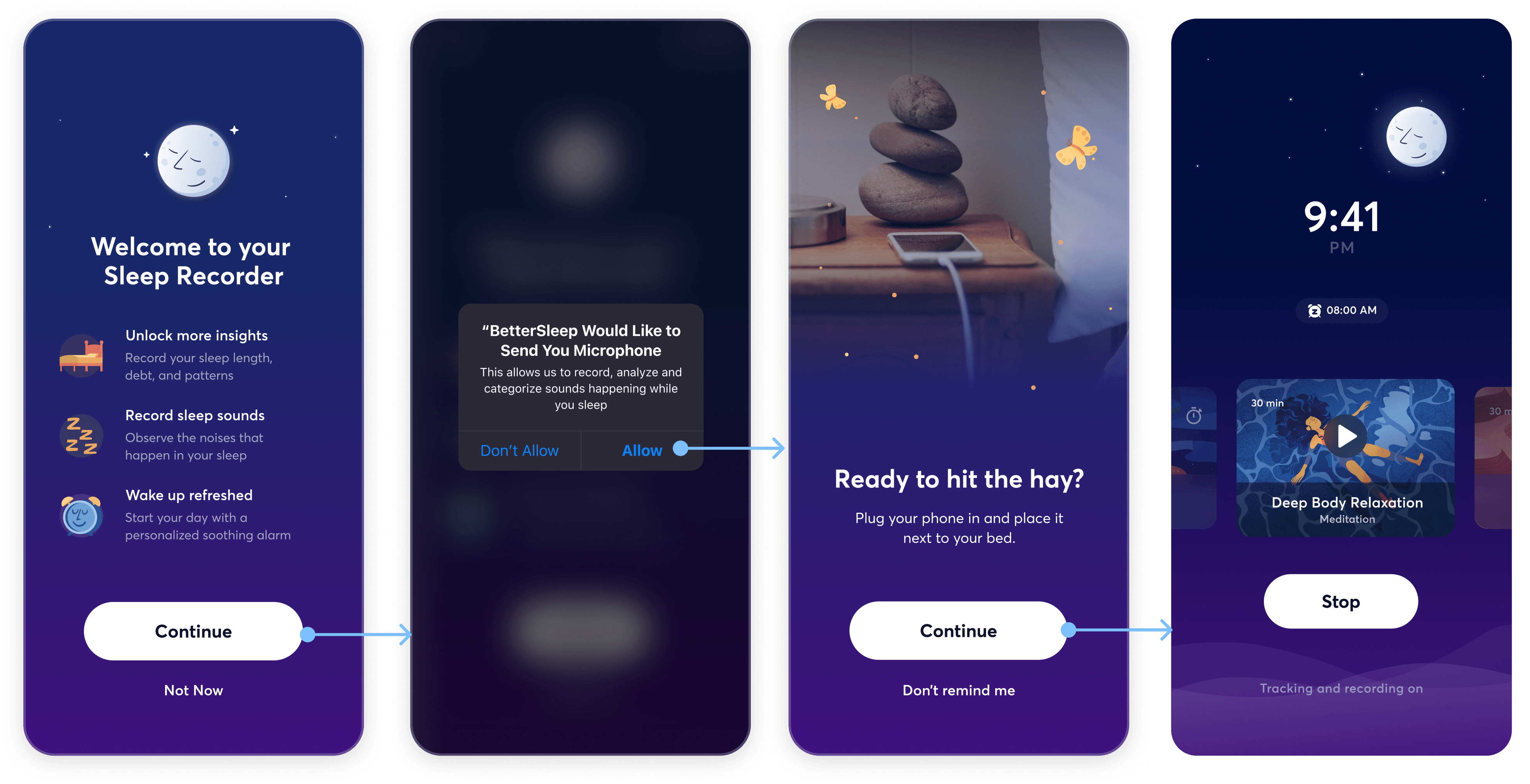
How can we redesign the user experience to keep users engaged, and improve the value of the sleep tracker?
During this phase we present our problematic, as well as our data and the insights we gained from our users. The aim is to generate ideas that solve our problem and help us to achieve our business goals.
Design
What are the core features to highlight and why?
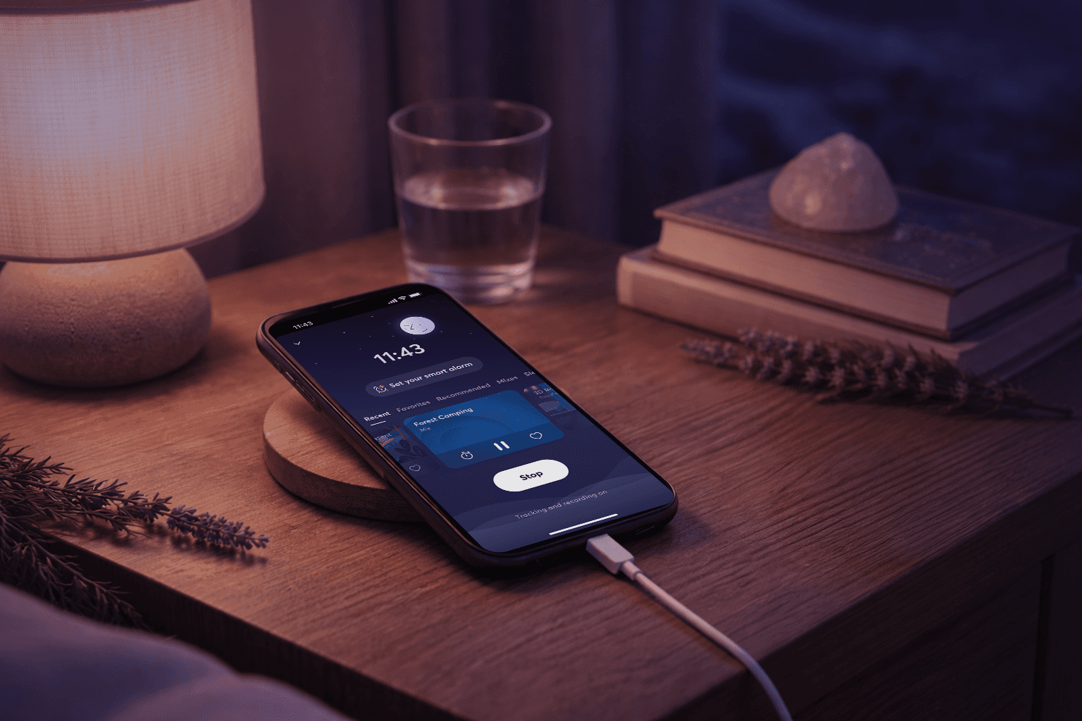
We identified the most intuitive and relevant features to highlight. One issue that came up frequently was sleep duration and alarms. That’s why we turned these two main needs into questions: What is your sleep goal, and when do you want to wake up? We also introduced a new way for users to use the alarm with 'Smart Alarm', which wakes them at the optimal time based on their sleep. In addition, we received a lot of user feedback about the tracker page and have added quick access to users' favourite content.